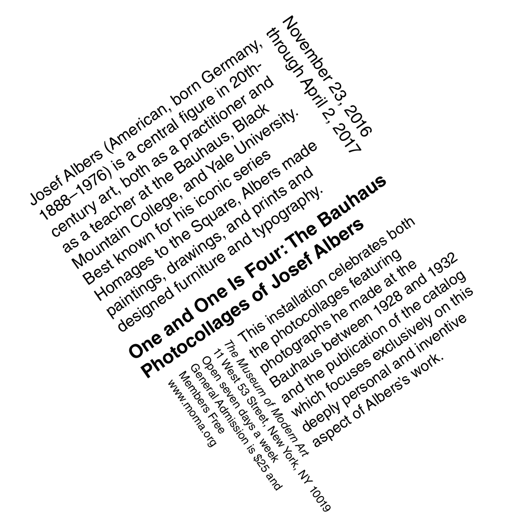
The Type Fundamentals Book is a semester-long project from my Typography I class. Every single layout is set in Helvetica only, no other typefaces, and the same block of text is used throughout the entire book. What changes from section to section is everything else.
The project is structured across six sections, each one adding a new tool to work with. Section 1 was the most locked-down, 10pt type and nothing else. From there, each section opened things up a little more: bold and italic in Section 2, scale variations in Section 3, diagonal axis in Section 4, graphic shapes in Section 5, and finally photography and color in Section 6. The restrictions were the point. Working within them made it clear what each individual tool actually does to a layout.
Assignment Brief
Six sections. One typeface. The same text, interpreted 35 different ways.
Every section started with hand sketches before anything went into InDesign. That part made a bigger difference than I expected. Having the composition figured out on paper first made the computer work a lot faster and a lot more intentional.
This project was made for DSGN 106 Typography I. The "dk" monogram on the cover was designed as a companion project in the same class. See how it came together in the Combining Letterforms project →.