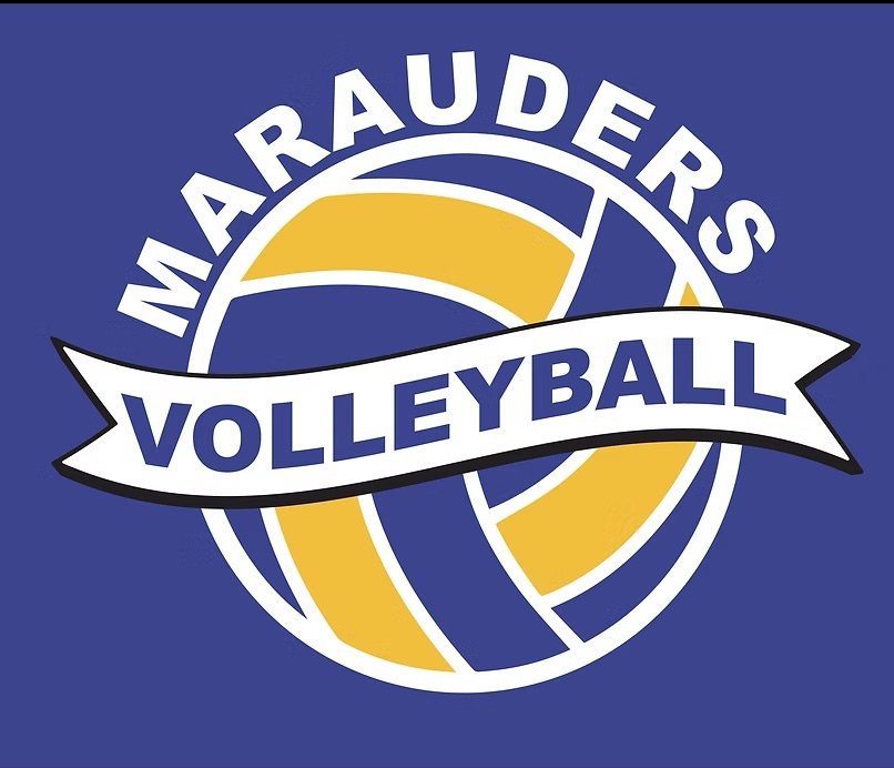
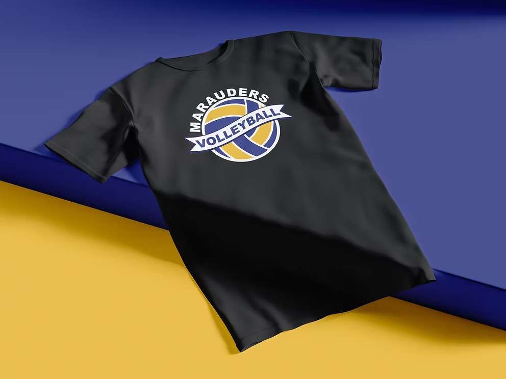
This was a personal project I made for myself, inspired by the MMHS Marauders volleyball program. The goal was to design something bold and athletic that could actually work on a shirt.
Design Note
The design needed to feel like something a fan would wear to support the team: connected to the Marauders and the school, and unique in its own way.
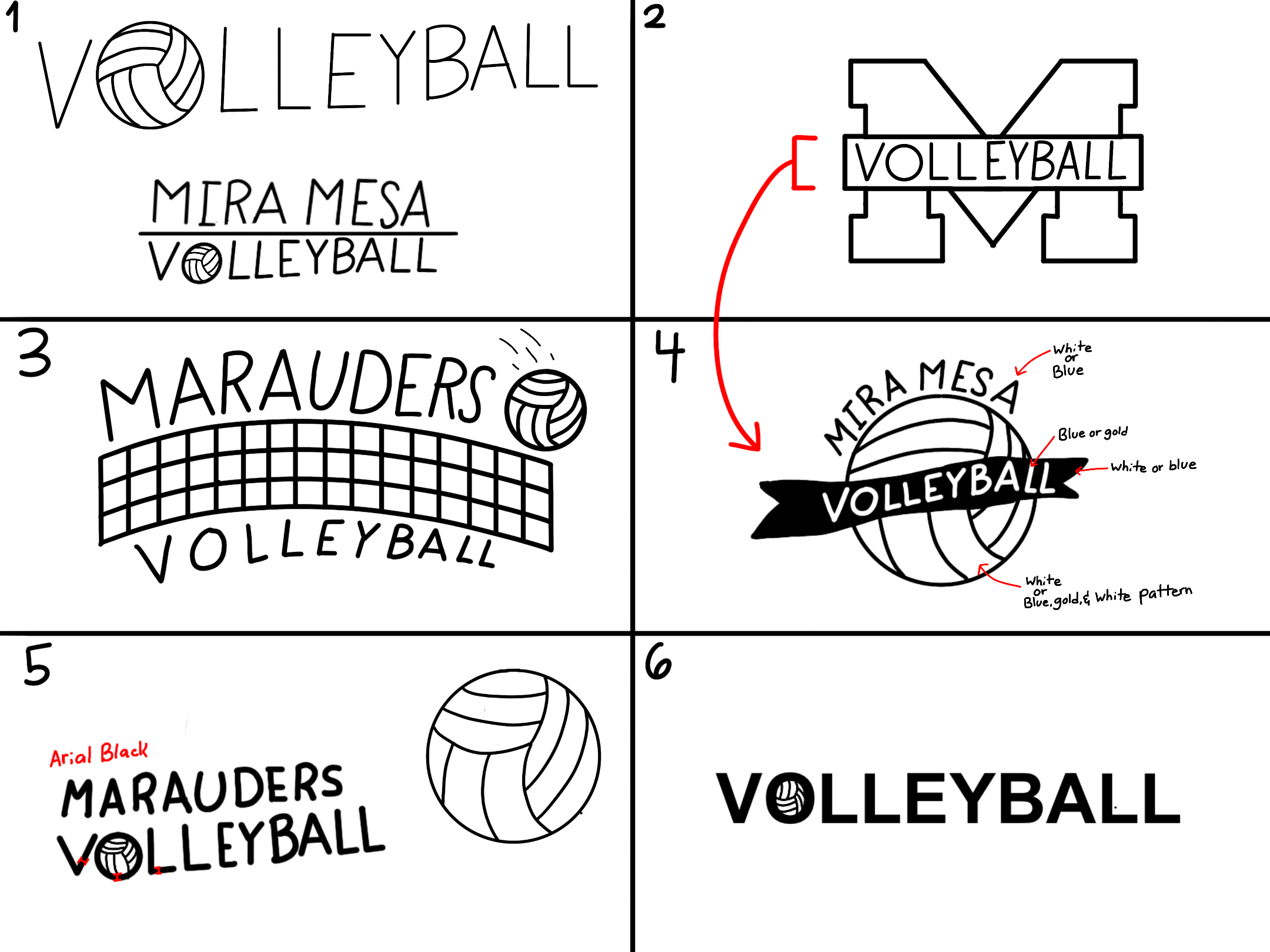
I started with six quick thumbnail sketches just to get ideas out of my head and onto paper. A couple of them were purely typographic, playing with the word "VOLLEYBALL" against the school's M. Sketch two is actually the real Marauders logo shape, the M with a banner across it that normally reads "Marauders." I swapped that text for "VOLLEYBALL" just to see how it looked, and that experiment led me to sketch four: wrapping a "Mira Mesa Volleyball" banner around an actual volleyball. That one felt like the strongest direction, so I kept pushing it.
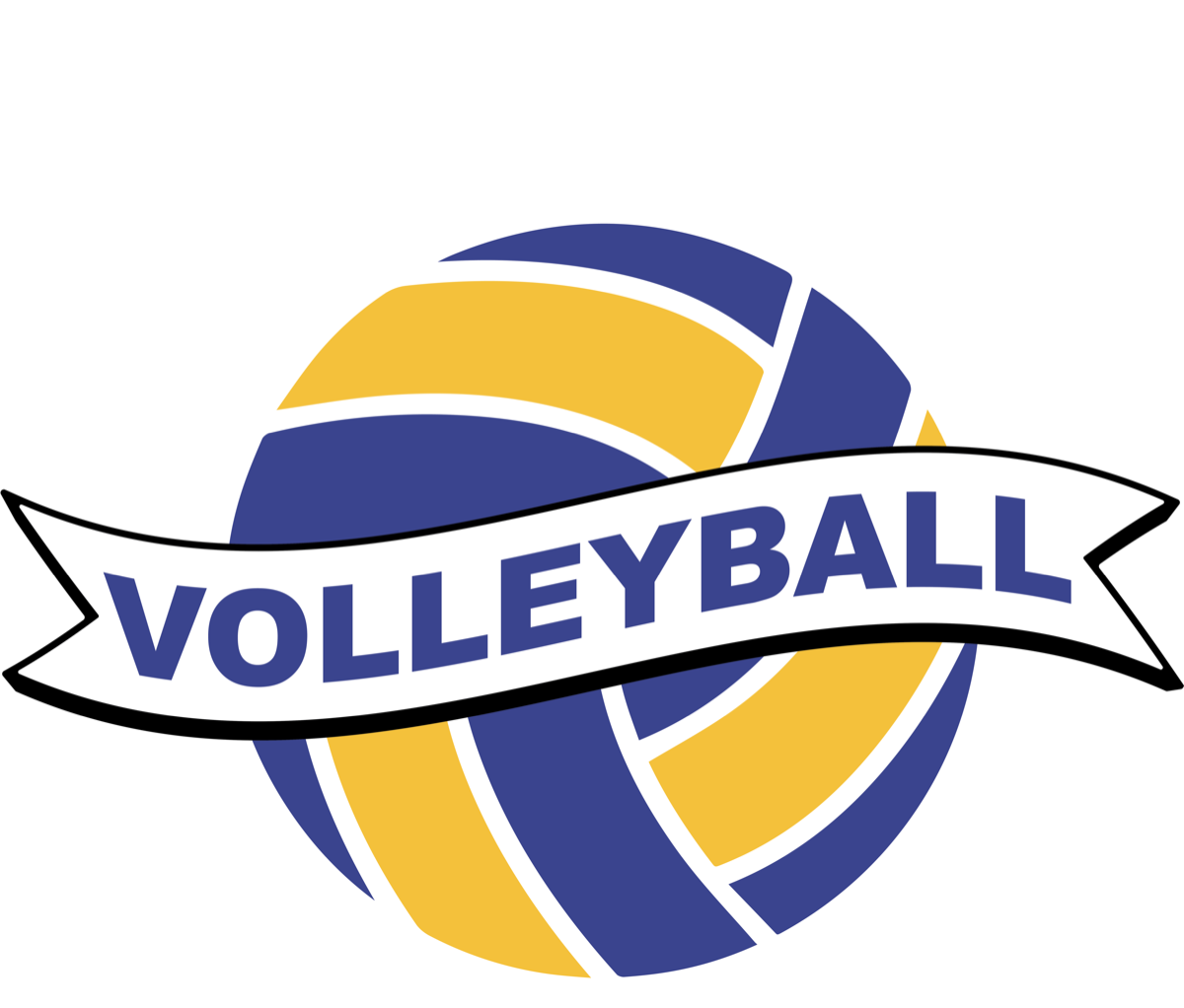
I redrew sketch four cleaner, swapped in the Marauders name, and locked the design into the school's blue and gold. From there I brought the drawing into Illustrator, traced it by hand, and cleaned up the linework and spacing until it held together as a finished design.
The final design came together using the school colors and a balanced composition that reads well on a shirt. It was a fun exercise in designing athletic apparel from scratch.
.png)