← All Work
Color Study
Color Study
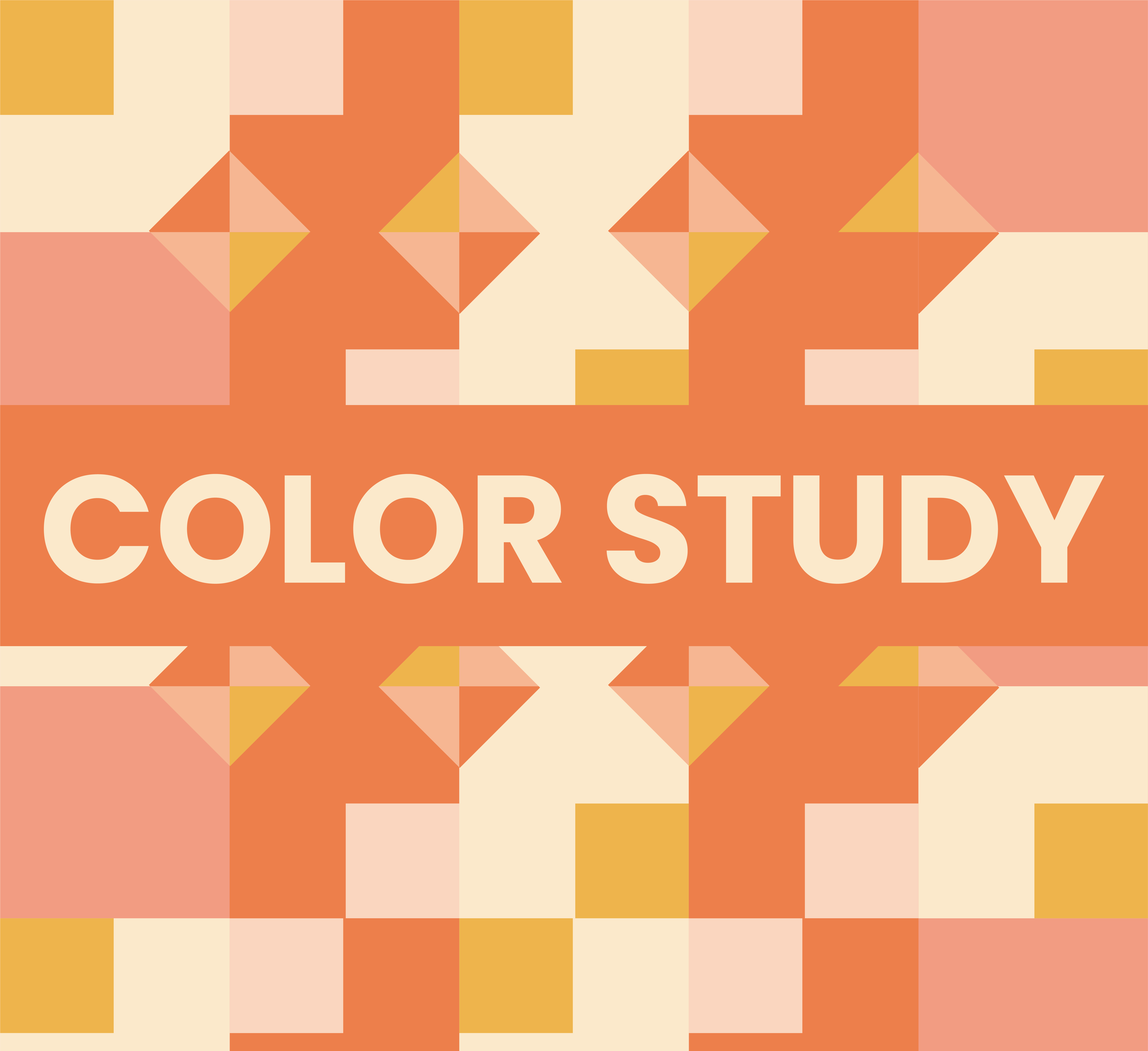
A color exploration of how tints, harmonies, and multi color palettes shape the mood and hierarchy of a single composition.
A color exploration of how tints, harmonies, and multi color palettes shape the mood and hierarchy of a single composition.
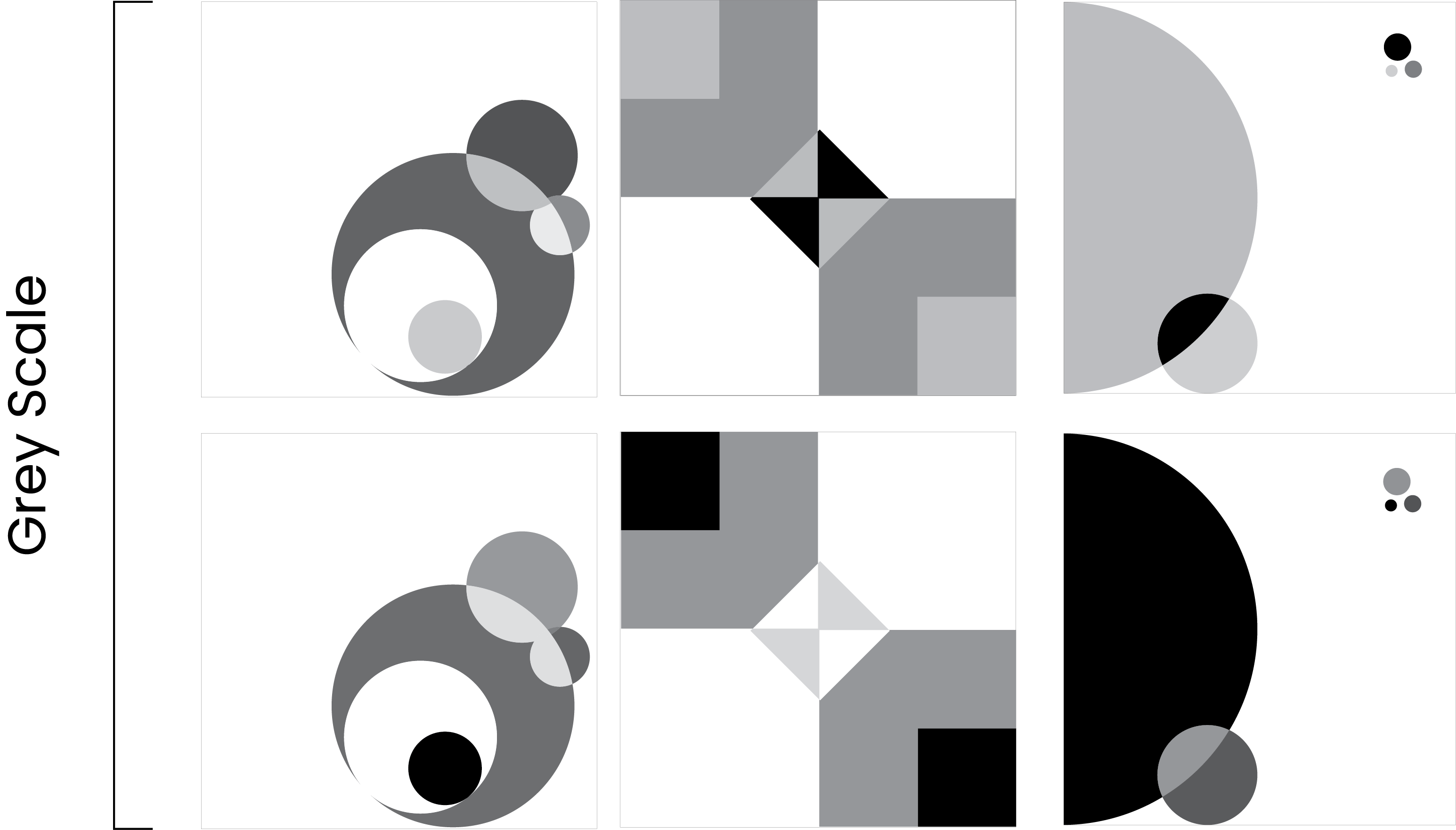
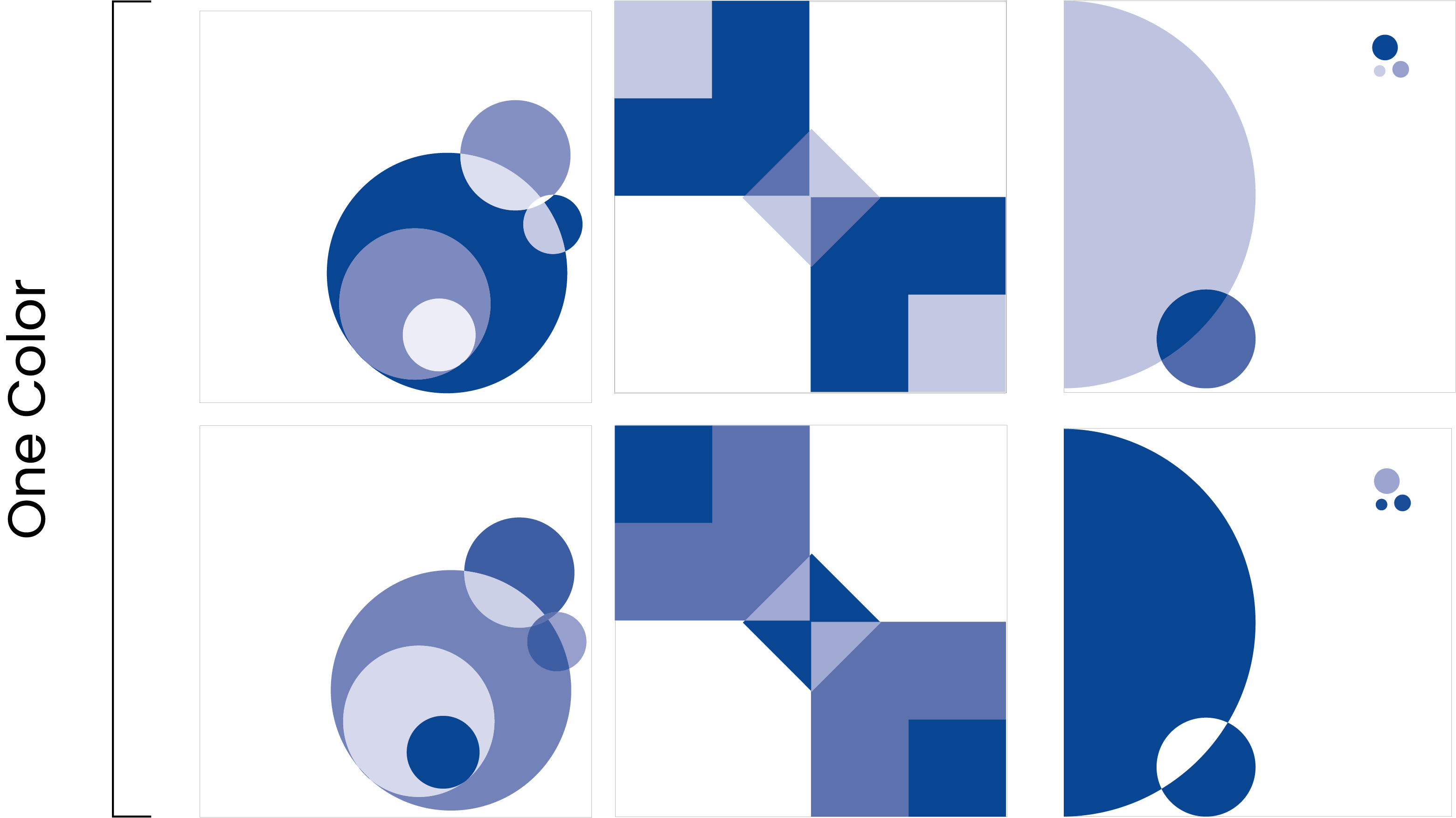
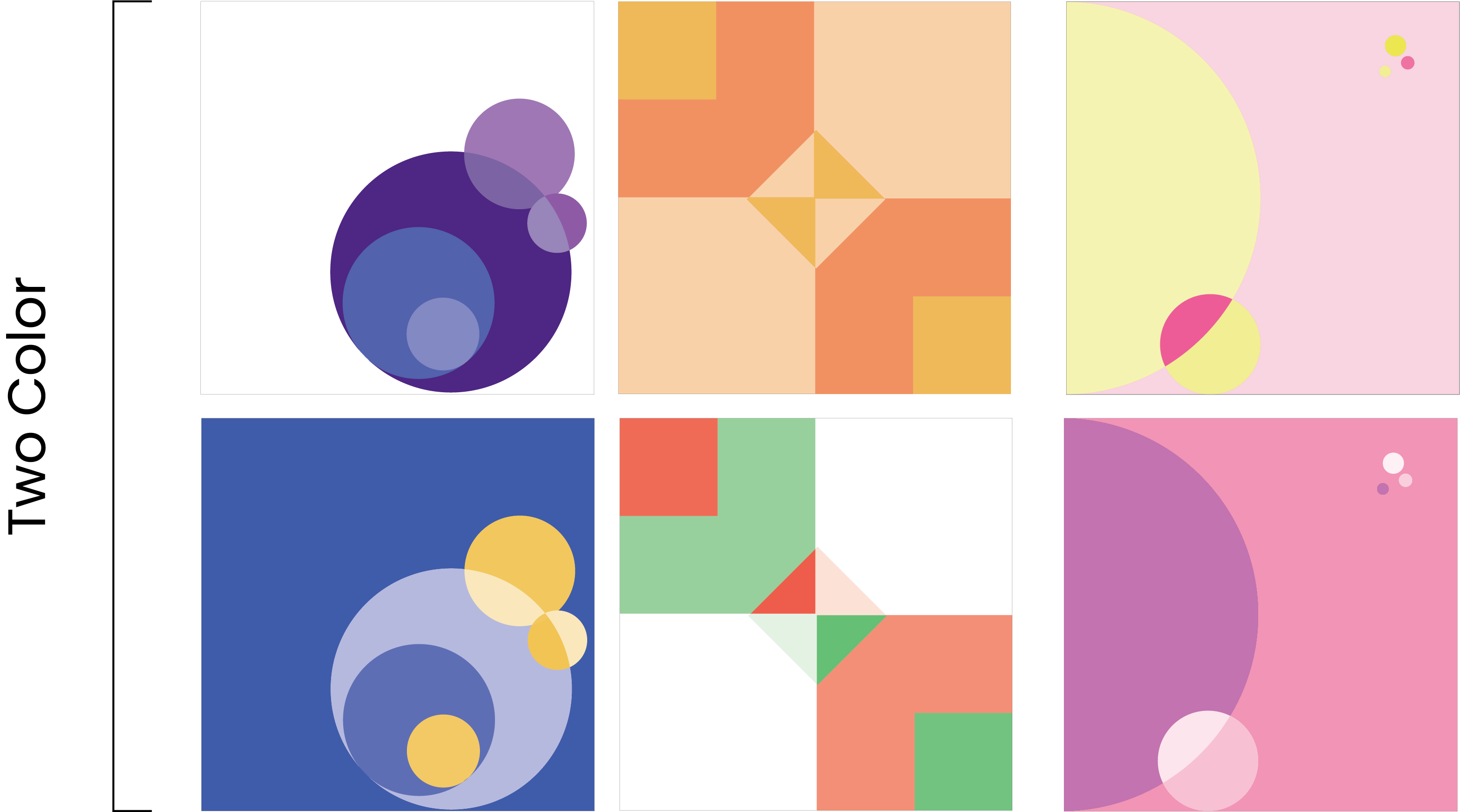
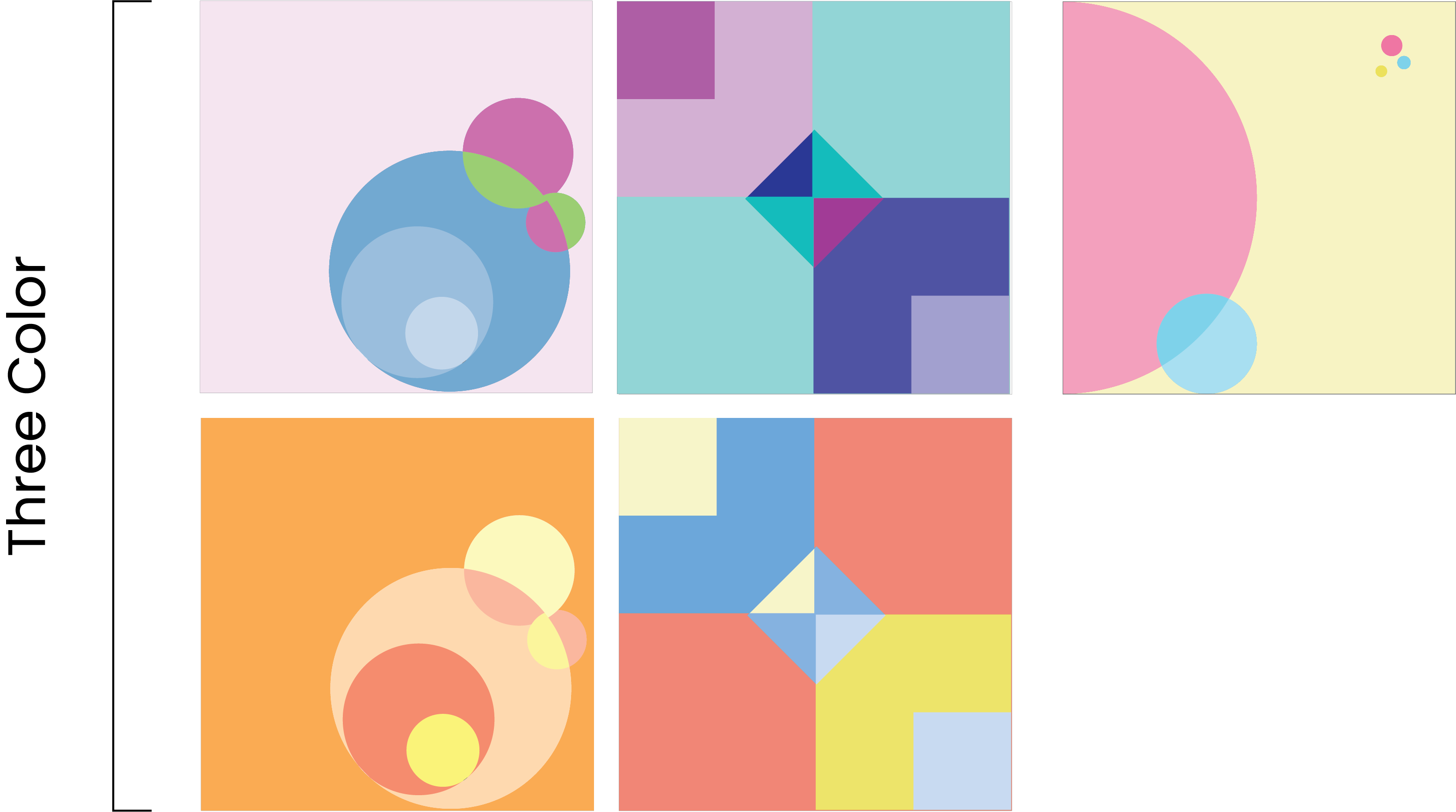
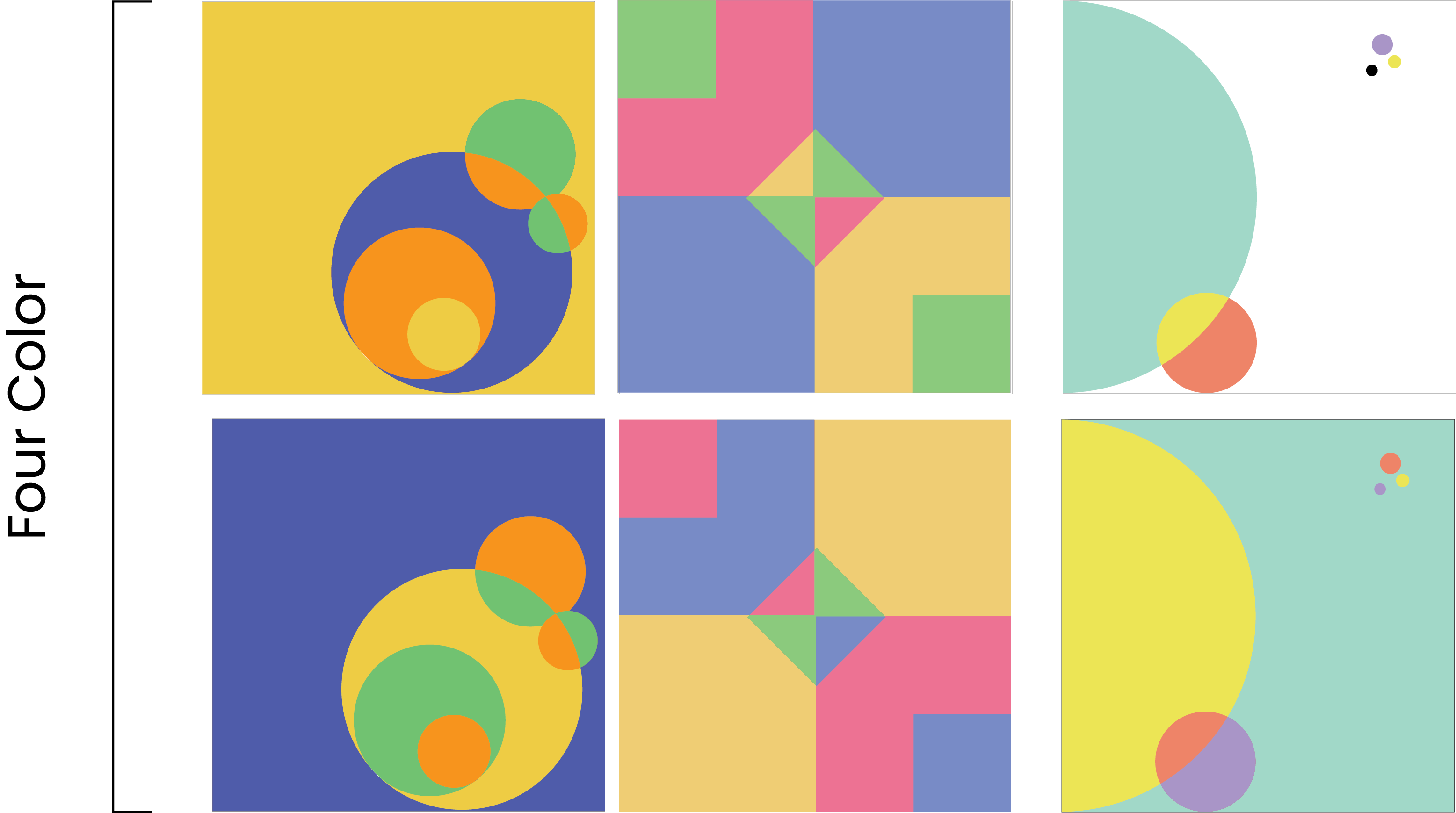
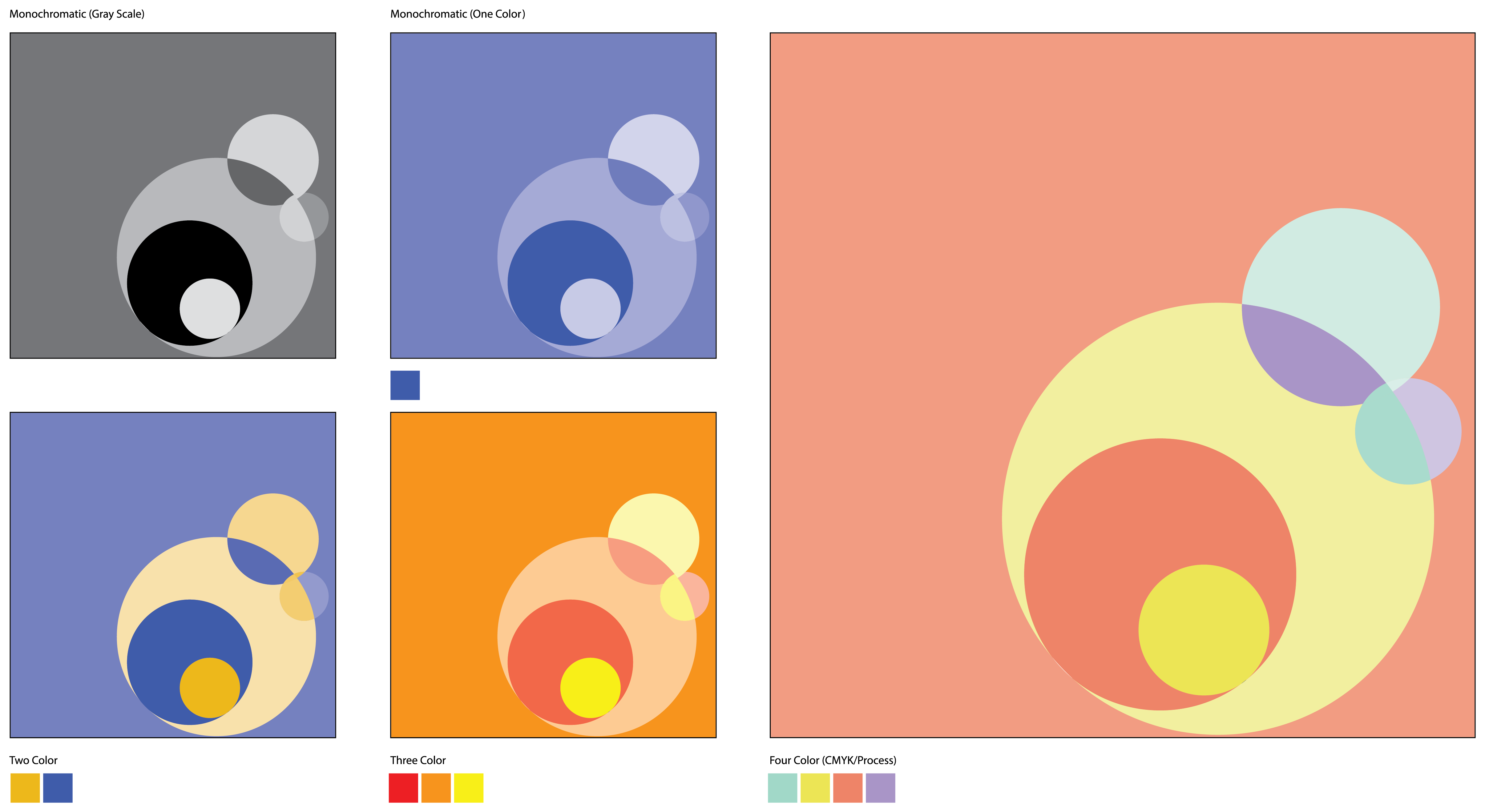
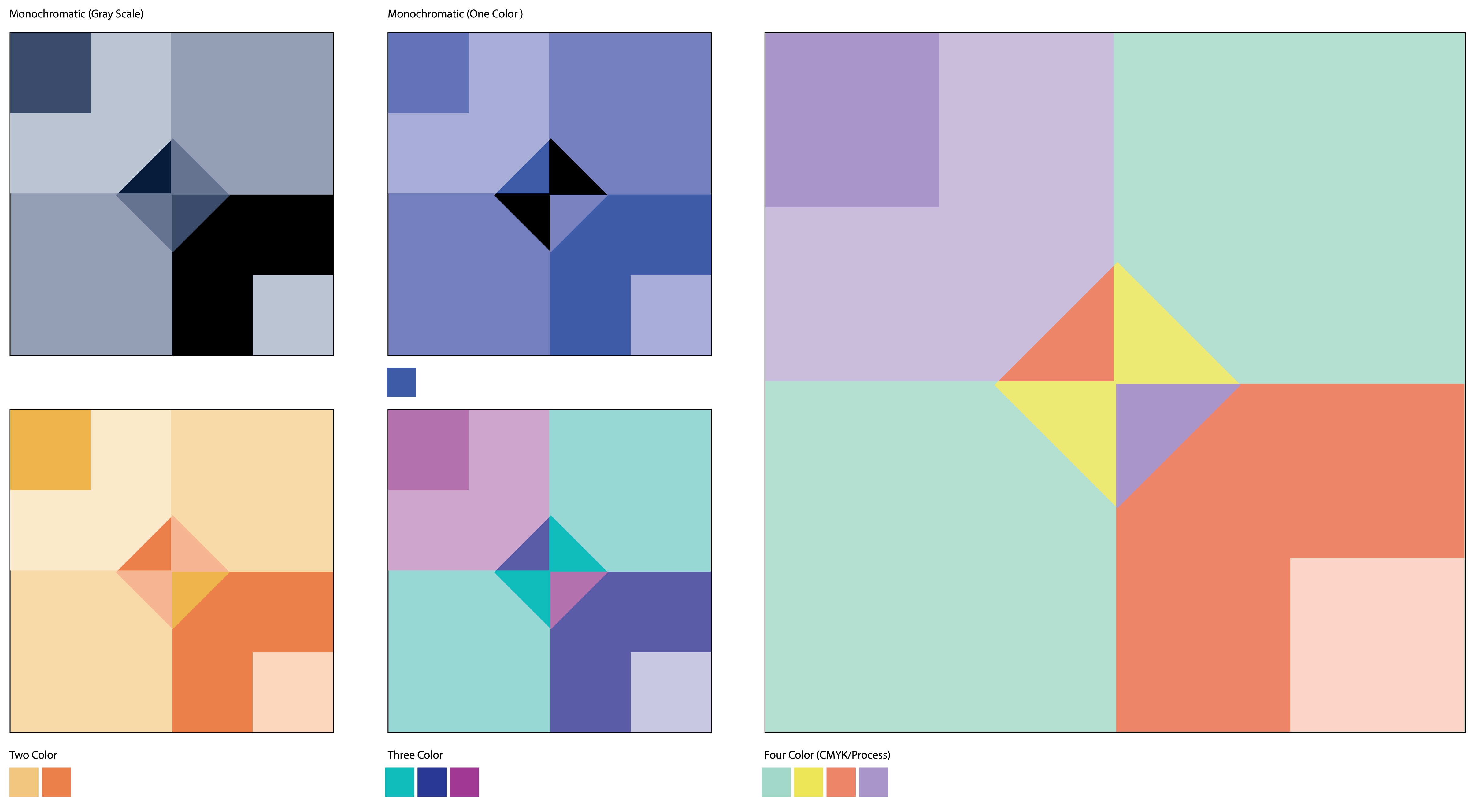
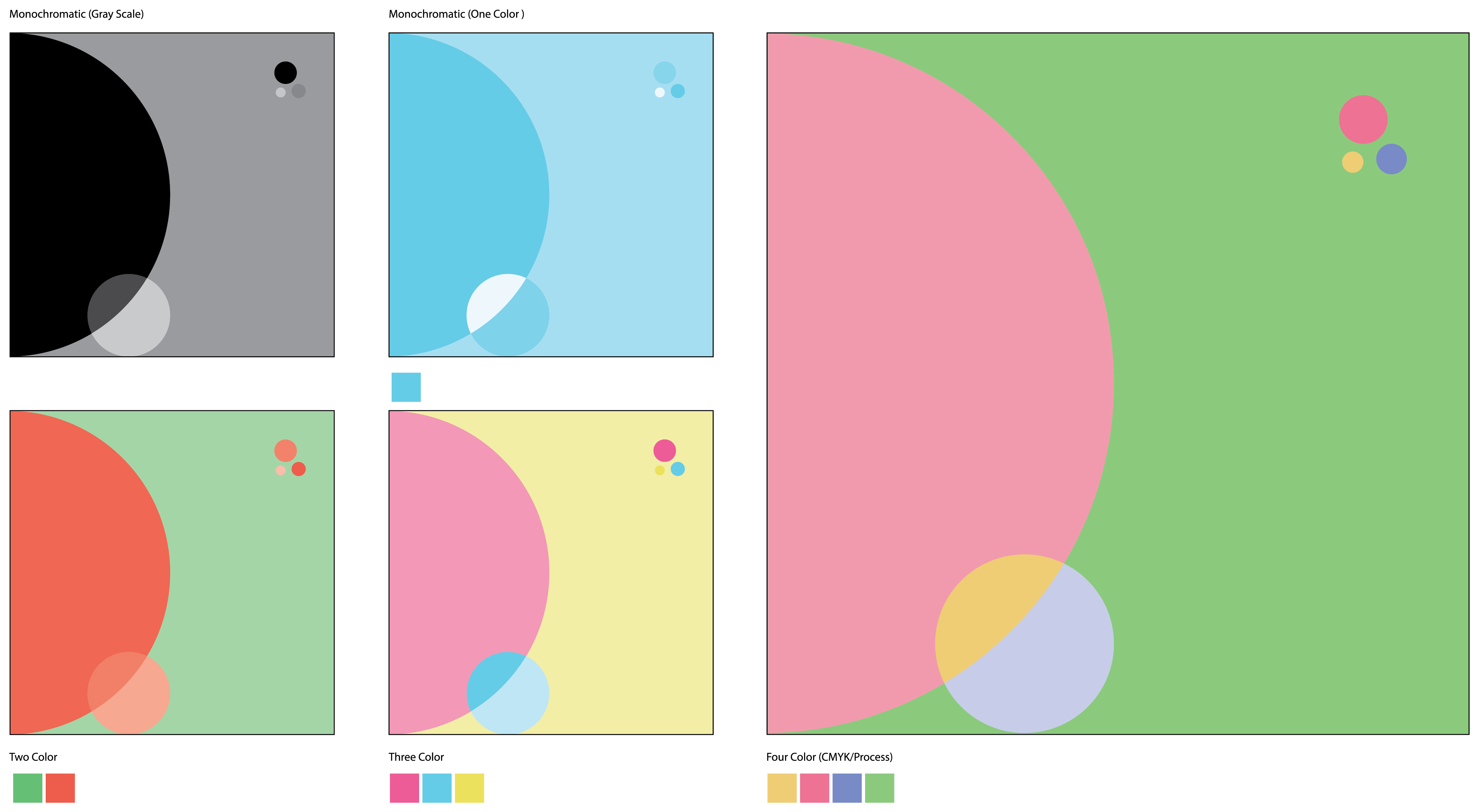
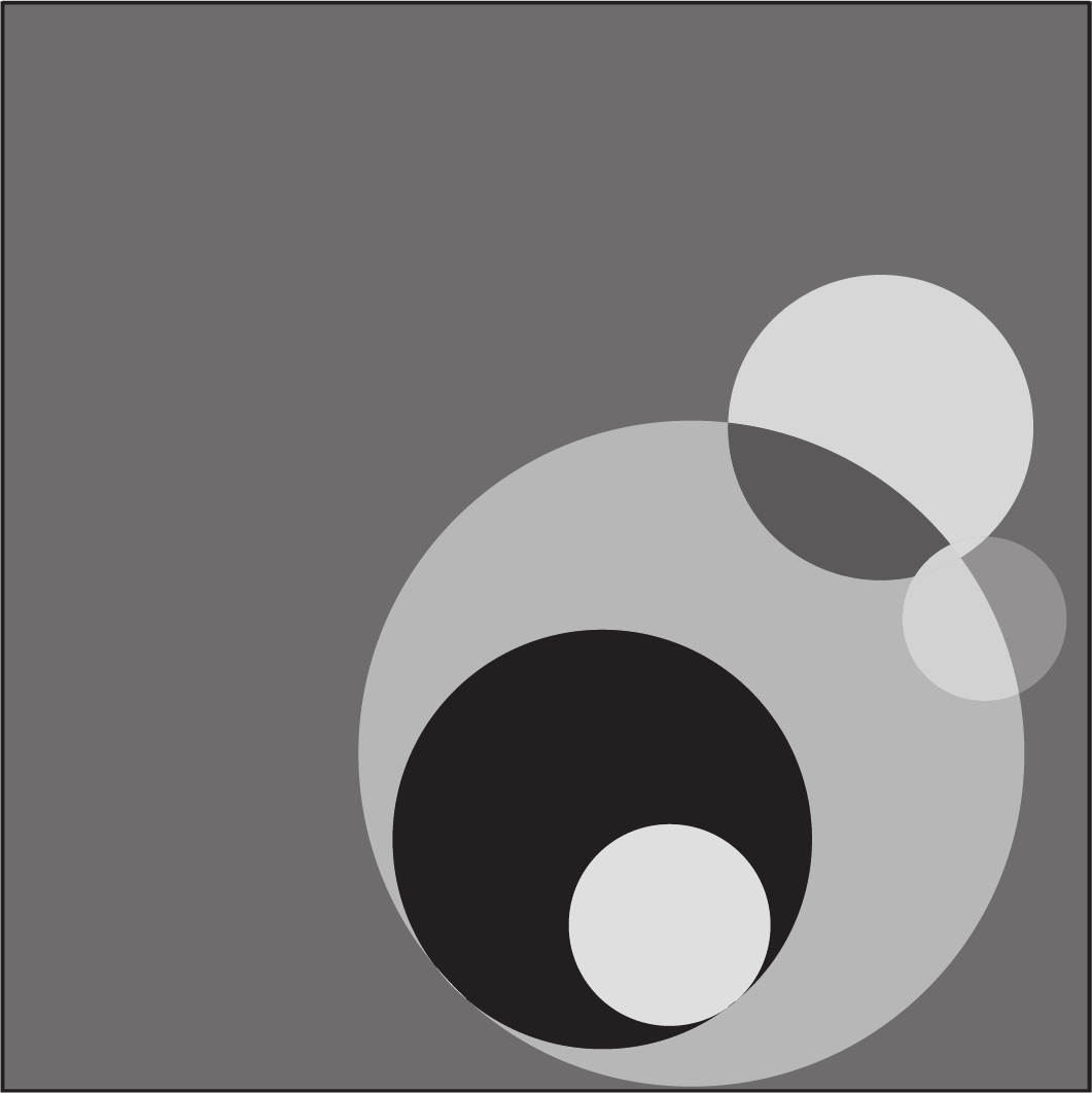
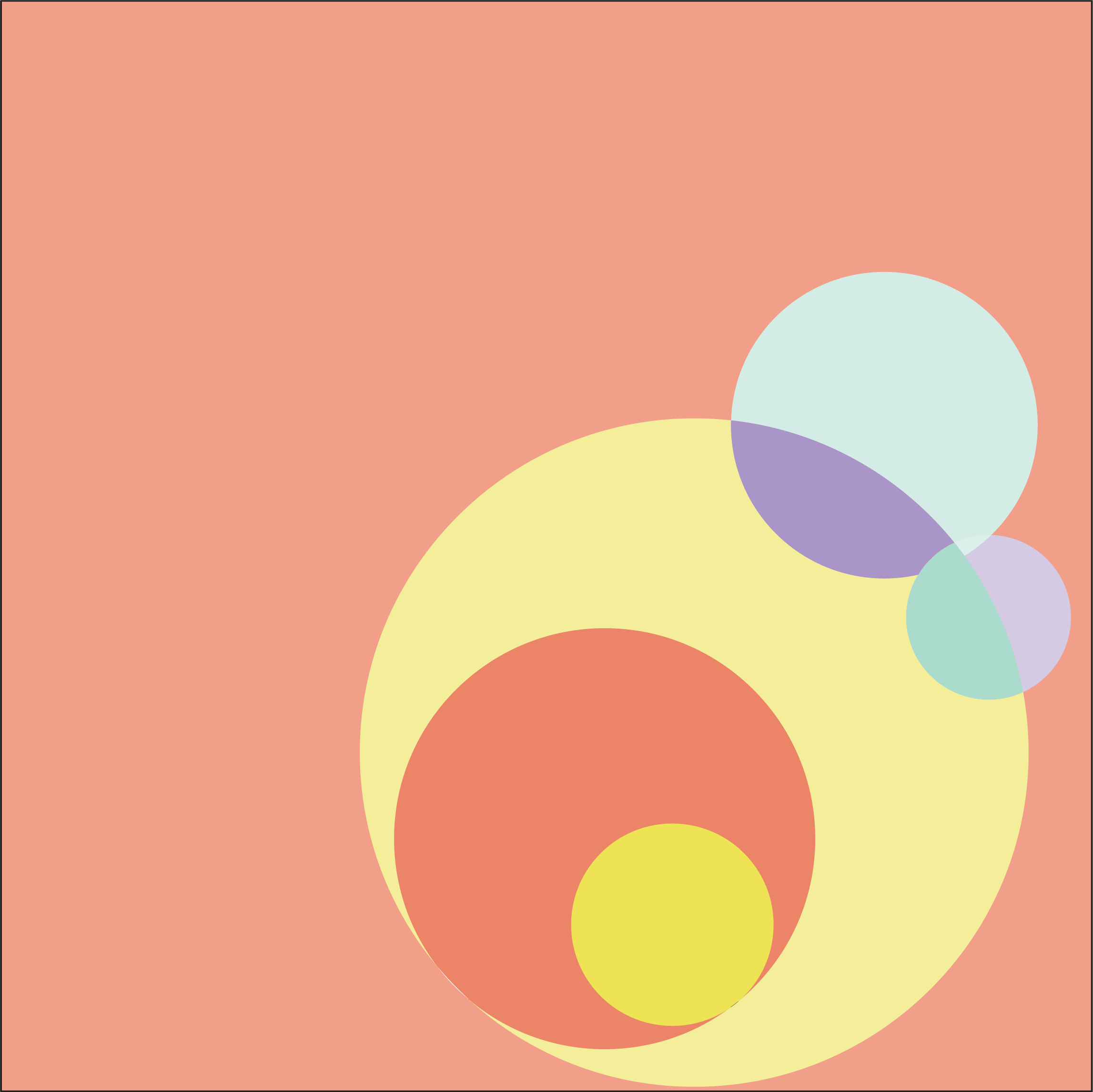
For the Color Study project, the goal was to explore how color changes the mood, feel, and hierarchy of a composition. We started by pulling our favorite explorations from the Design Fundamentals Study, then tested them in grayscale, one color with tints, two colors with tints, exploring complementary and analogous color combinations, three colors with tints, using warm, cool, and triadic color combinations, and four colors in CMYK.
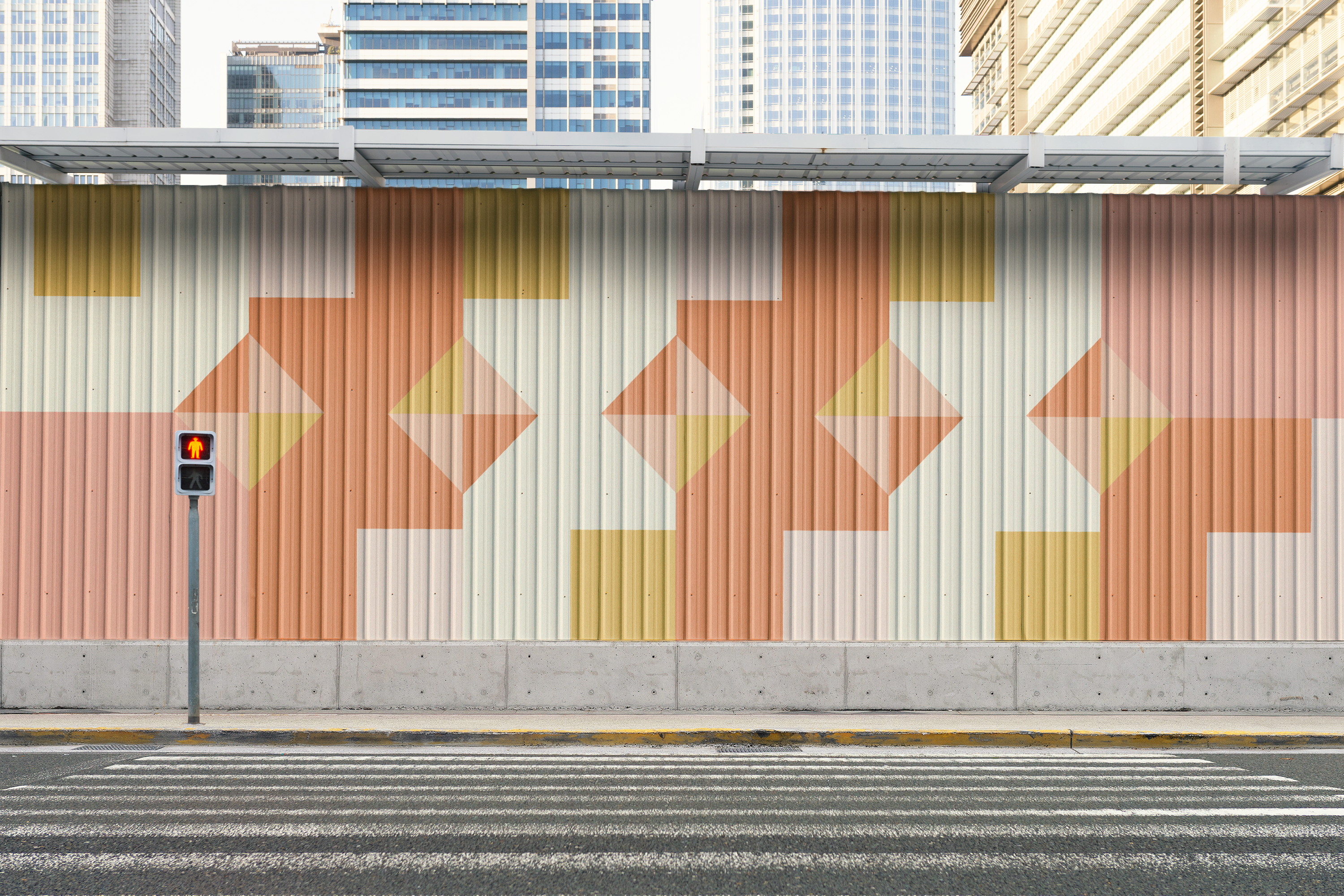
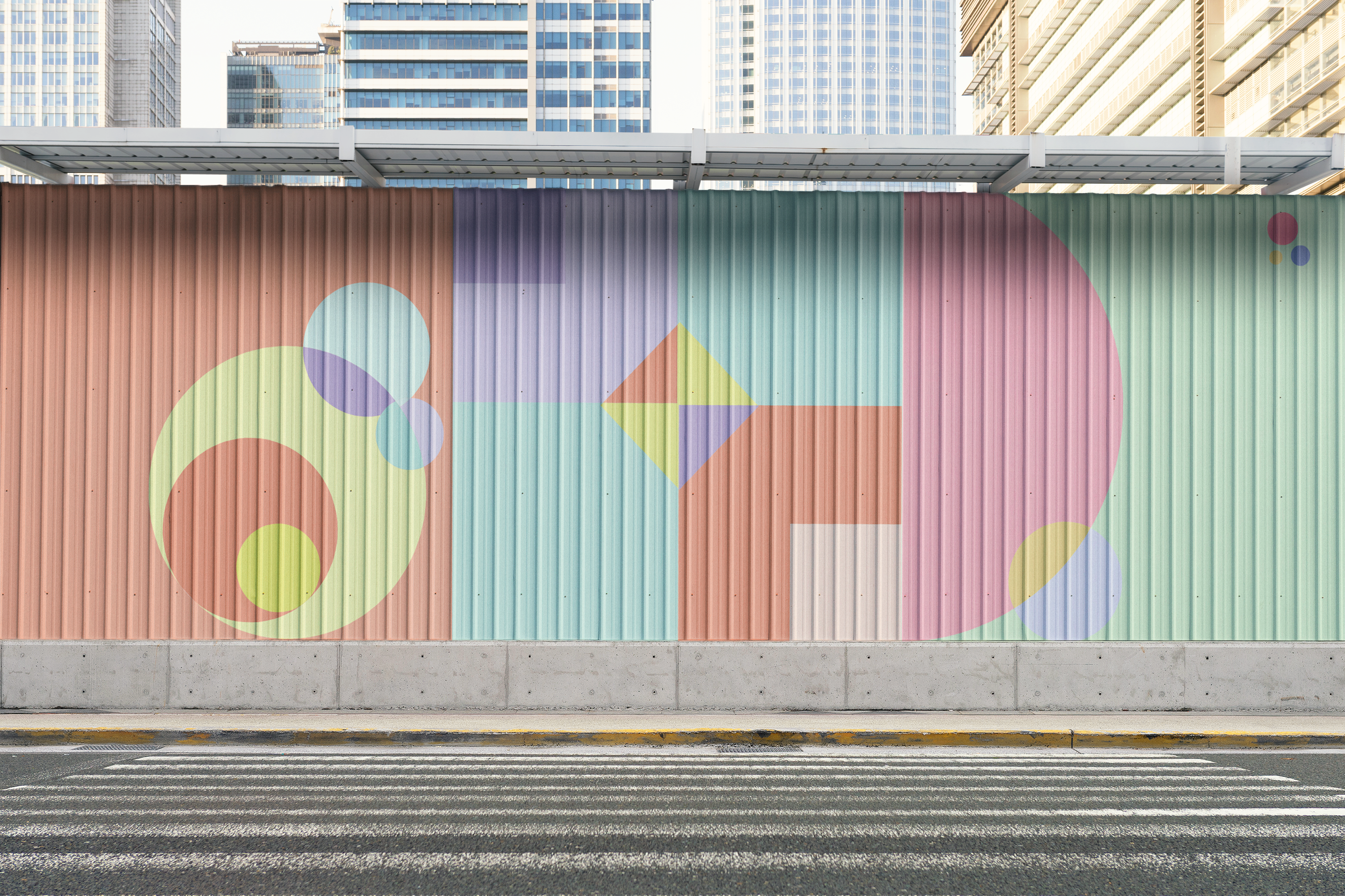
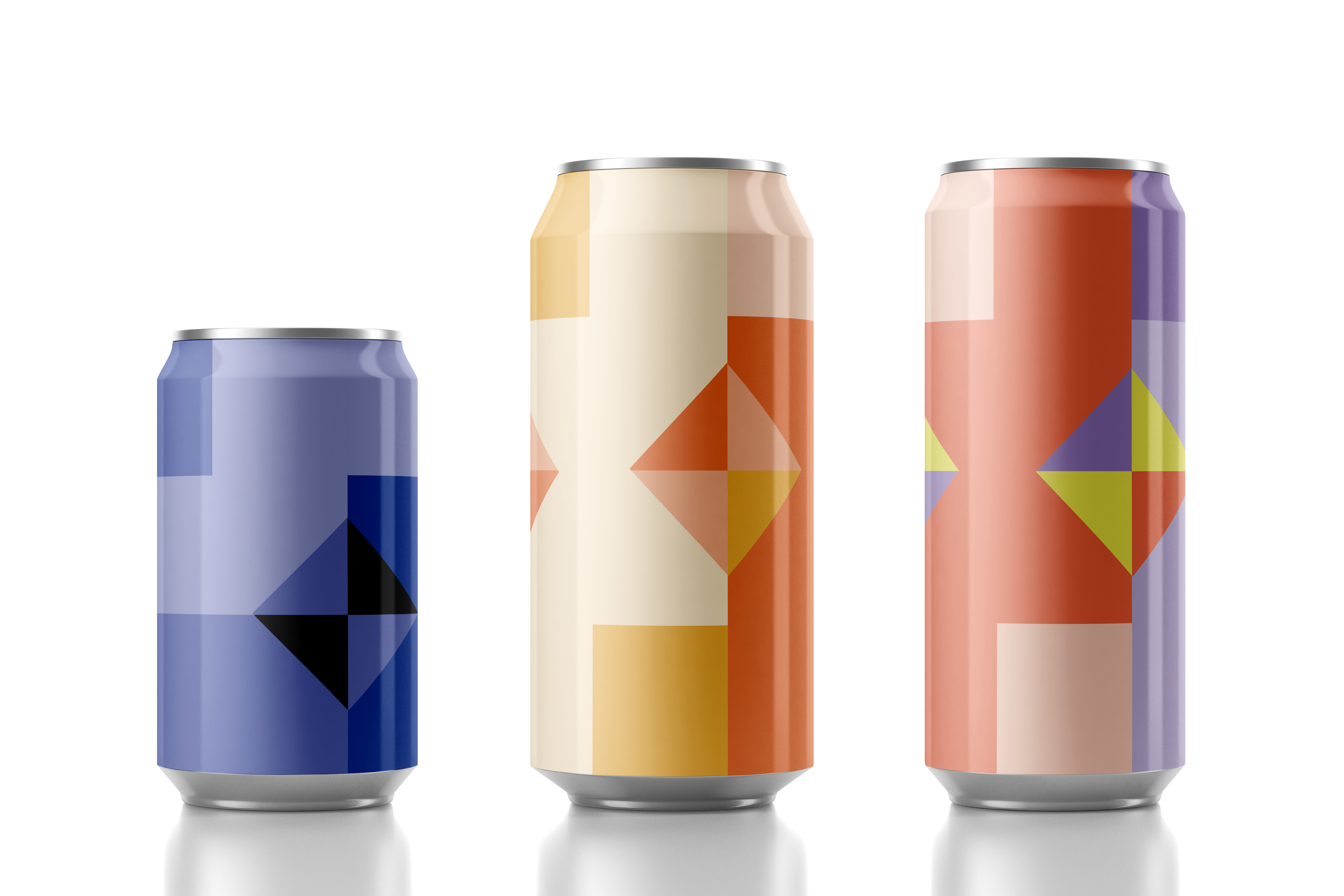
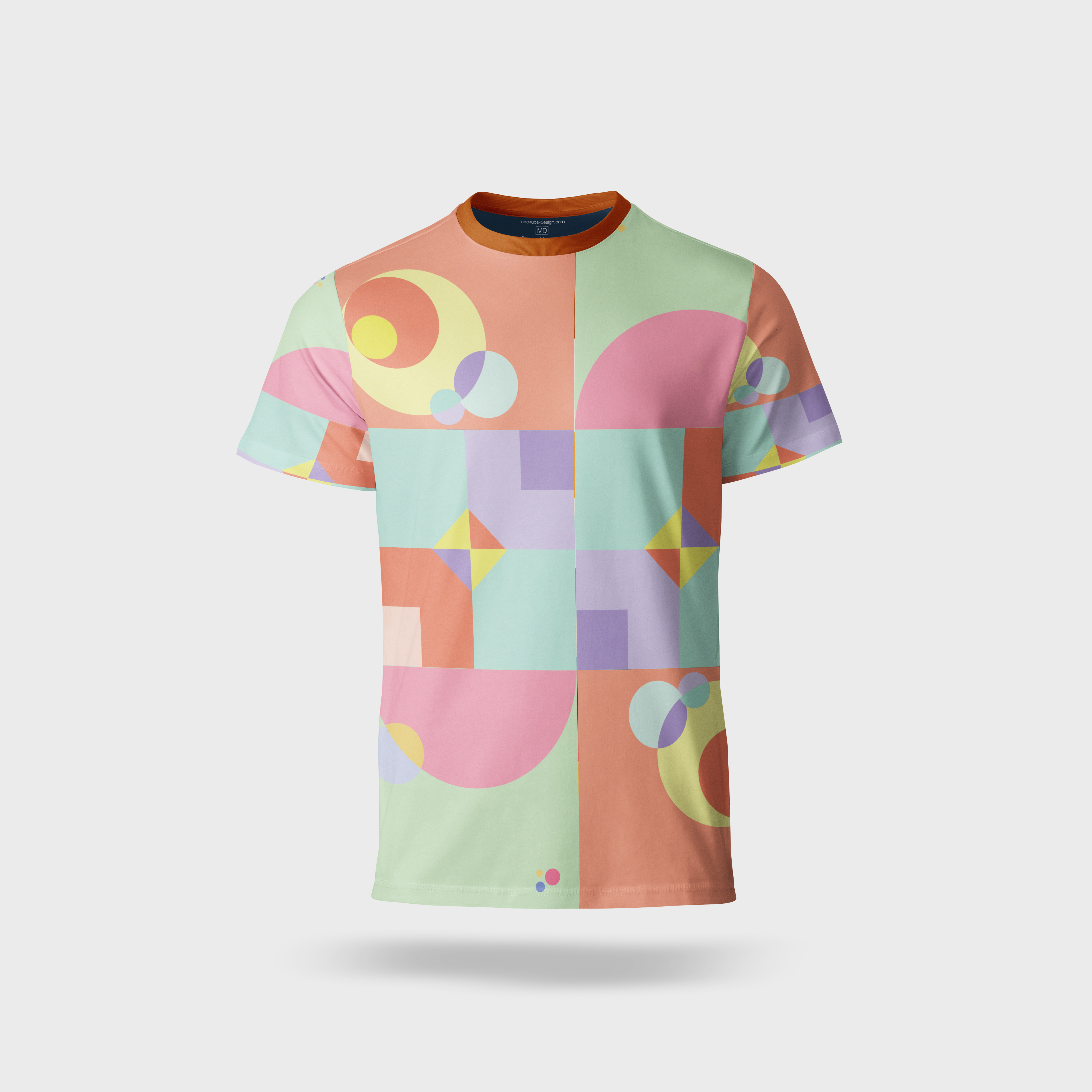
After receiving feedback from classmates, I refined the color systems I felt were strongest. From there, I chose one final composition and applied every color approach to it, from grayscale up to four colors. To finish off the project, I designed a pattern using a layout and color system I thought looked good, then applied it to a few mockups to show how the color choices could work in real life.